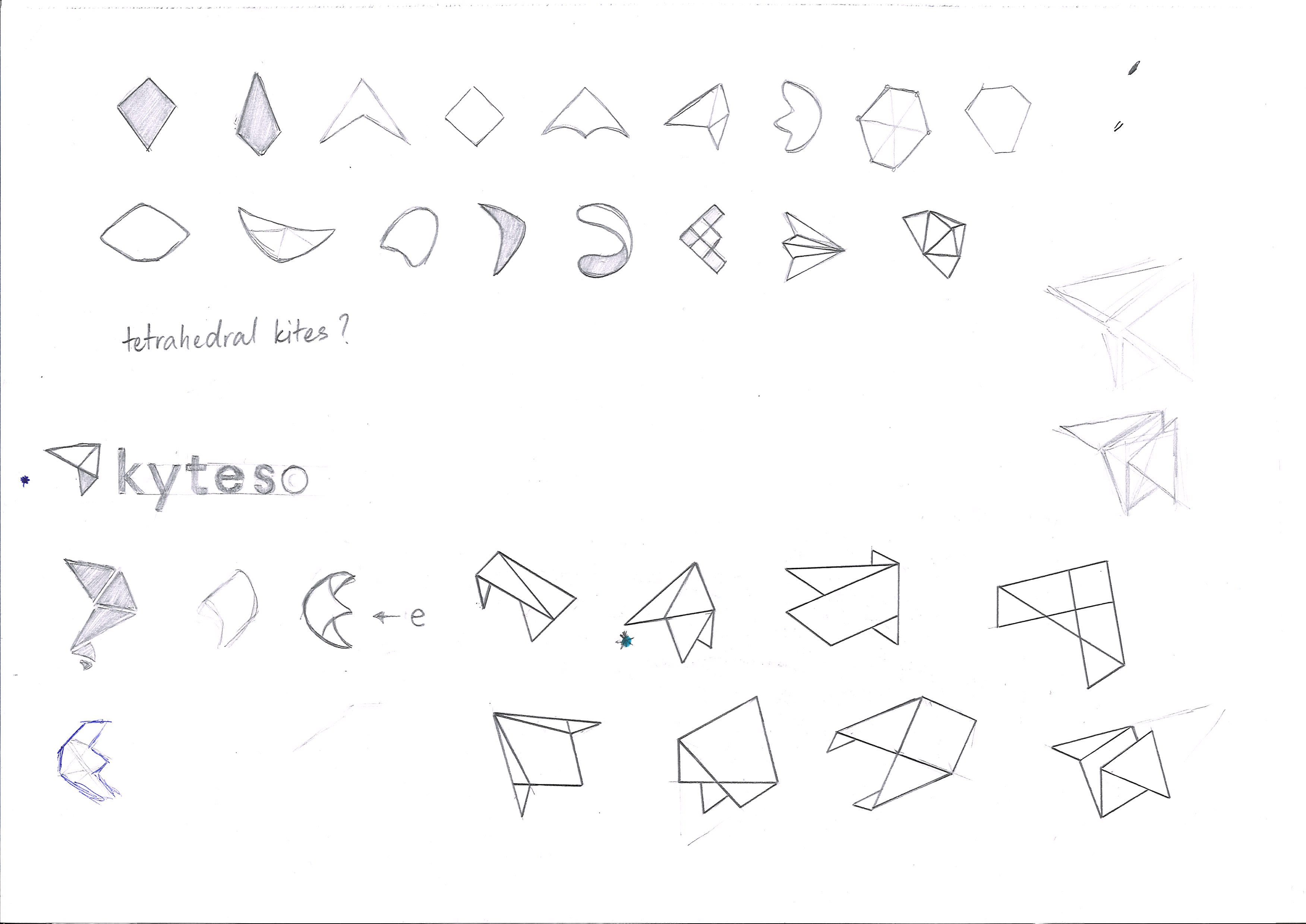
There were several iterations that we made but we eventually settled into coming back to the basics: triangles. The 3 points would represent the tool's main features, with the dark purple overlap representing easy integration.
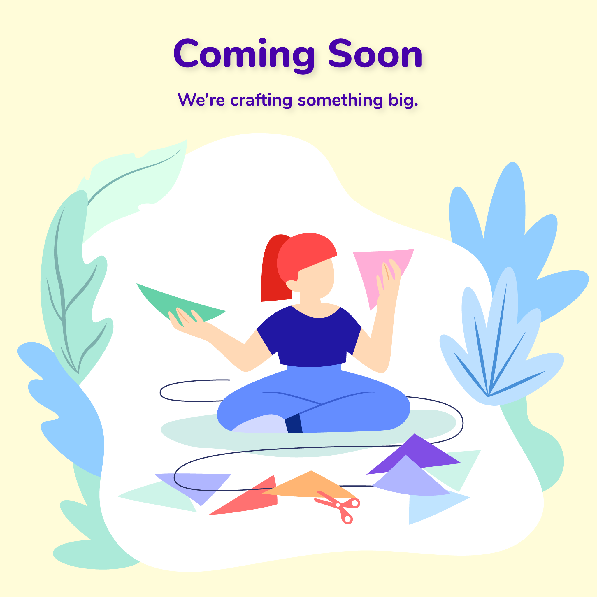
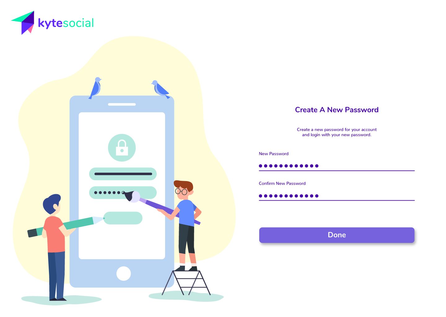
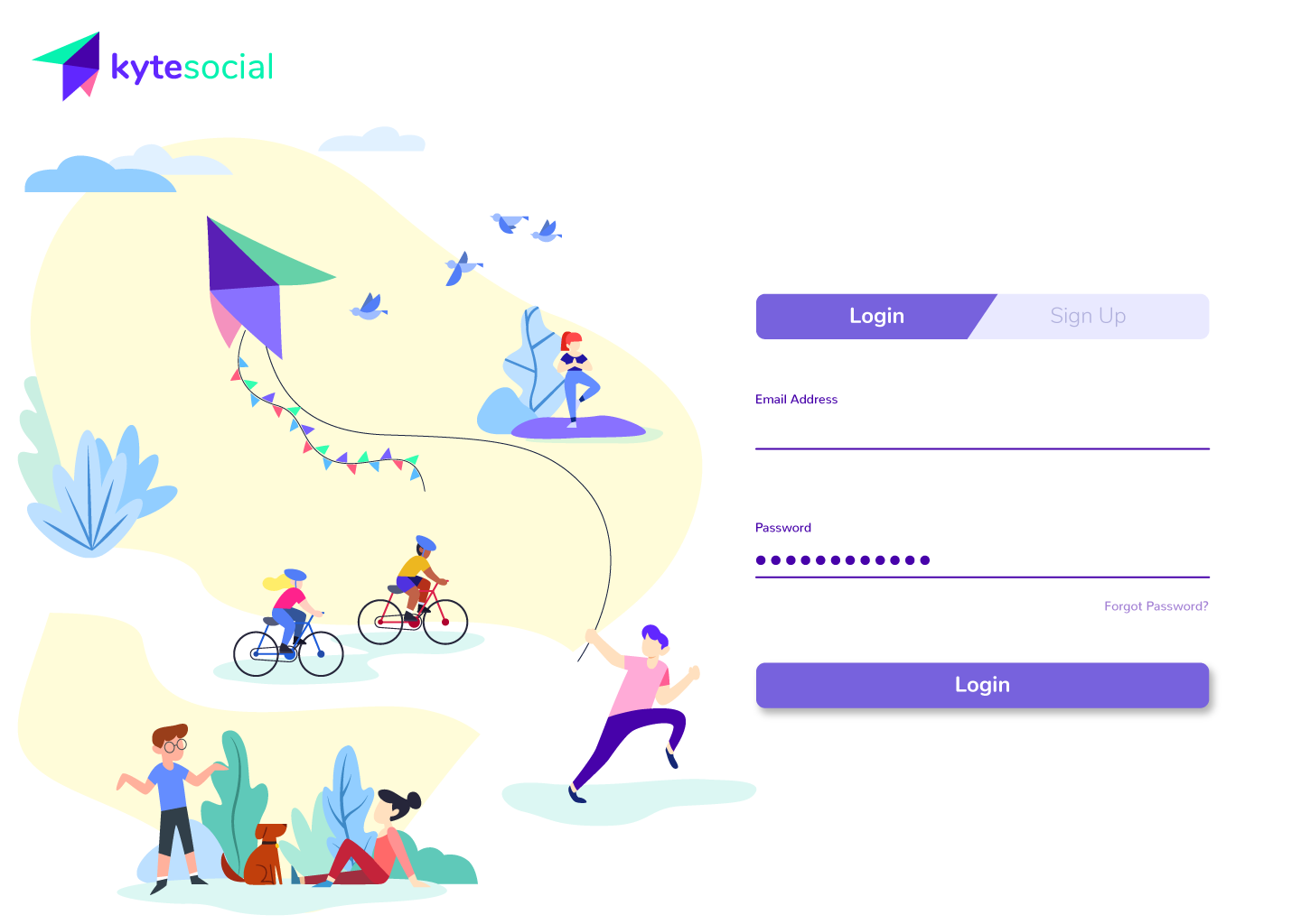
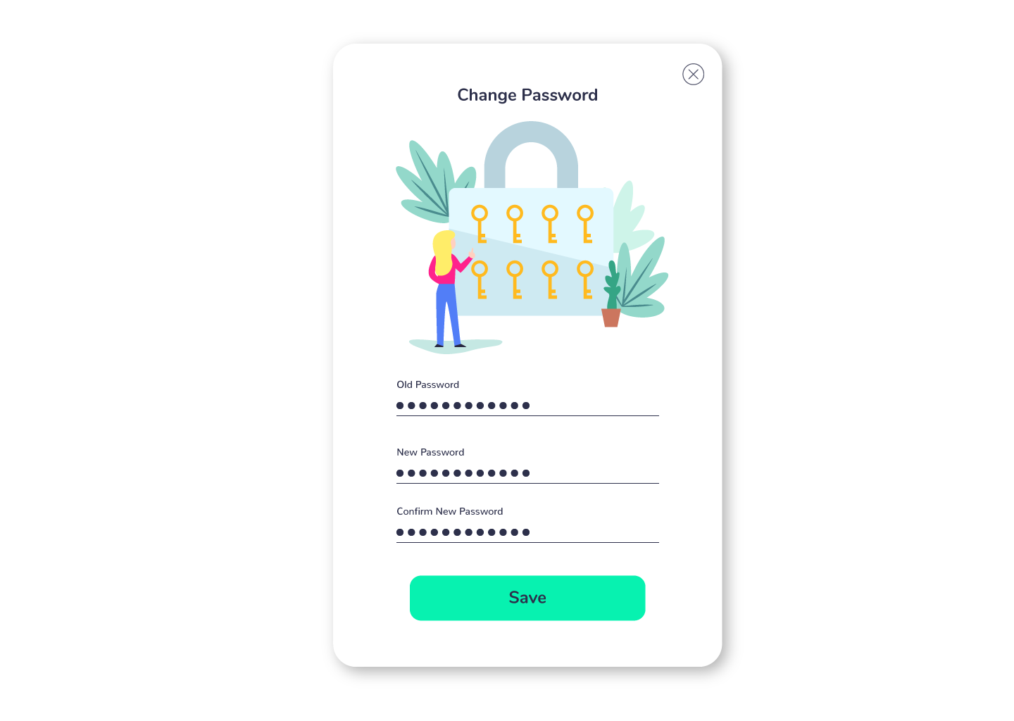
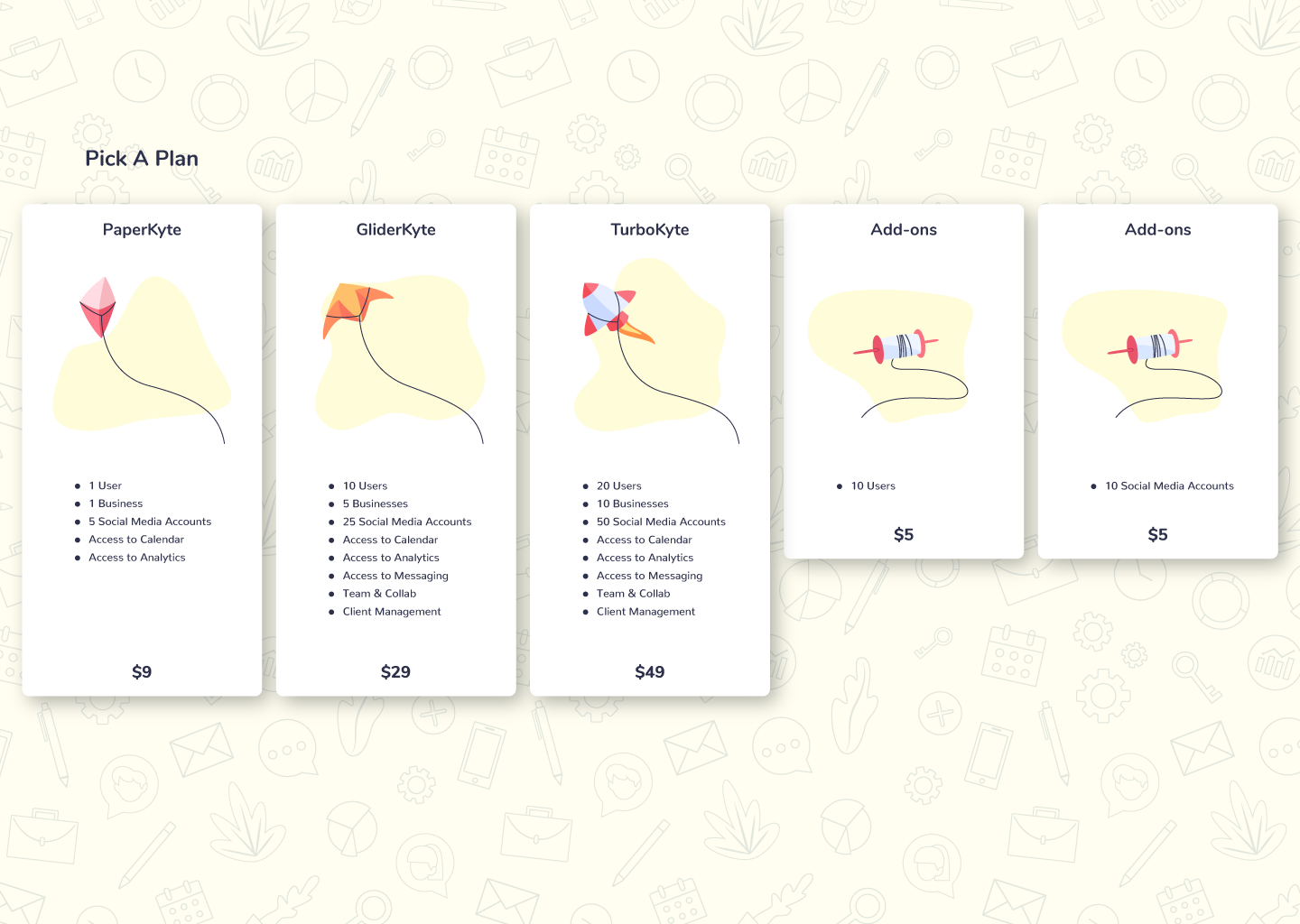
We decided to go with flat designs as a call-back to approaching things with simplicity. This was also to make it easier to onboard new designers to the project.
We had to waste a lot of digital paper
And no, we hate killing trees.